Rhapsody in Blue
With the help of two design-minded experts, a showbiz couple integrates their love of the East Coast into a Toluca Lake home.

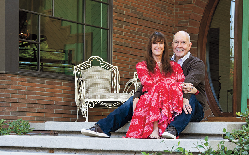
When Chris and Laura Bauer moved here from the East Coast last summer, they didn’t want to completely abandon that aesthetic. The ties run deep. The East Coast is where they began life as a couple, had two kids and still own a home.
For their new digs they settled on a 1930s structure, just a stone’s throw from Lakeside Golf Club, that had been remodeled as a spec home. It was well built but, as Laura puts it, “completely charmless. So we decided to transform it into something with more of a Hamptons feel.”
Chris is an actor (True Blood, Survivor’s Remorse) who just completed work on Money Monster with George Clooney and Julia Roberts. Laura is an accomplished costume designer who takes on jobs when they don’t interfere with taking care of the couple’s children, Mercy and Beau.

They hired local builder Kirin Stone (KStone Construction and Development) for the transformation. One of the first hurdles: how to handle the pie-shaped design of the home. Kirin, a finish carpenter by trade, tackled the challenge with meticulously crafted and well-designed paneling.
“The paneling, although it appears simple, was very difficult to get right. With its pie shape, the home has very narrow hallways. We had to really manage the wainscoting build-up and keep it as thin as possible yet make sure the recess and shadows really made the paneling pop, Hamptons-style,” Kirin explains.
Paneling also played a role in transforming an ordinary split-landing staircase, which ends on a second-floor landing with low ceilings. The addition of Shaker paneling gave the space distinction and charm; dual pendant lights provided further enhancement. And custom wood railings with hand-carved spindles completely upped the ante.


DARK SHADOWS A powder room invokes a dramatic mood with striped ceiling wallpaper and tiled floors.
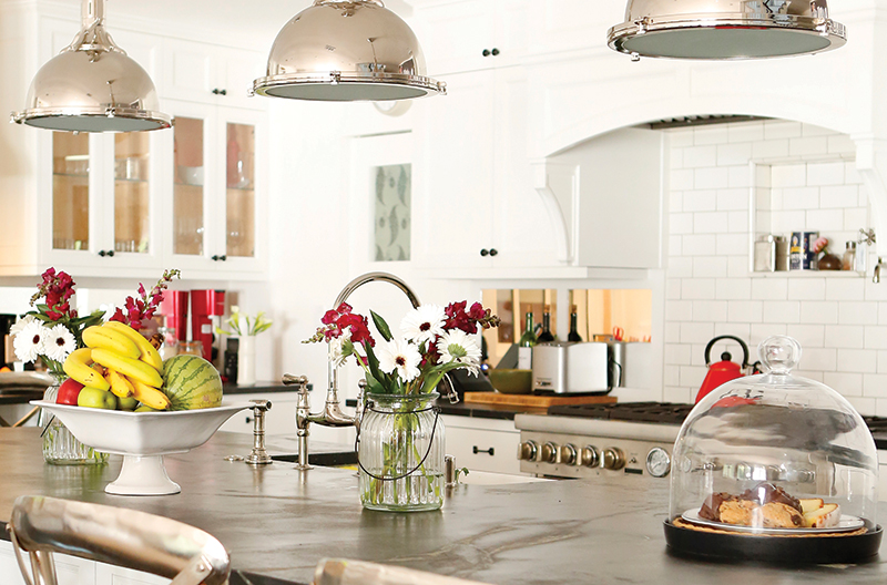
An unexpected pop of color in the blue-hued home comes from the banquette, adjacent to the kitchen, where the family enjoys most of their meals. The banquette is upholstered in dark blue leather and set off by ikat pillows in a variety of bright colors.
In what the couple describes as a stroke of brilliance, designer Mary Luby came up with the idea of constructing a wall behind the banquette. It provides some much-needed space to hang art, as well as offering storage via a hall closet built on the backside.
One of the most interesting rooms is the second-floor master suite—an airy, bright space with super-high ceilings and a built-in bookshelf filling an entire wall. “We used to have a Brooklyn loft, and Chris had the idea of basically replicating that vibe,” says Laura.
Gazing at the large shelving unit with the Bauers, Mary muses, “I wanted it to feel old and funky. Looking at it today, I do think it has kind of a SoHo vibe.”


That same vibe can also be felt in the master bath, which has a metal casement shower stall designed to resemble “an old phone booth in the Bowery” and wall-mounted sinks with exposed hardware. At the other end of the bathroom, window trim over the Roman tub is painted black. ”I realized there is no other dark trim in the entire house, but it just gave the space some balance,” says Mary.
A spiral staircase leads to a loft where Laura focuses on her passion for quilting.
Chris’ favorite room is his den. Padded, textured walls mute noise so Chris can read scripts, learn lines, meditate and play his guitar. A leather chair bought at the Rose Bowl Flea Market sits in the corner.
Demonstrating the remote control retractable window shades in his “man cave,” Chris says when he is comfortably ensconced in his leather chair he feels perfectly content. Though he’s now enjoyed the room for a year, he says he still finds it amazing.
“Look, I’m not really a guy who just automatically goes out and hires a designer. But the things Mary thought of were really incredible. I love this room—it just saves me!” he chuckles.

Shelve It
Interior designer Mary Luby offers some tips for creating artful shelves.
- Do groups of three or four things instead of rows.
- Arrange in an asymmetrical way.
- Mix old and new books but keep them in one color palette.
- Take a step back and review with a critical eye. Do the items look like they belong there organically? If not, rearrange.
- Shopping suggestion: Hit Blackman Cruz on Highland. There is a terrific selection of interesting items from around the world.


