Interior Designers Share Their Favorite Pandemic Projects
Before and after.
-
CategoryHomes
Balcony by Colette Shelton
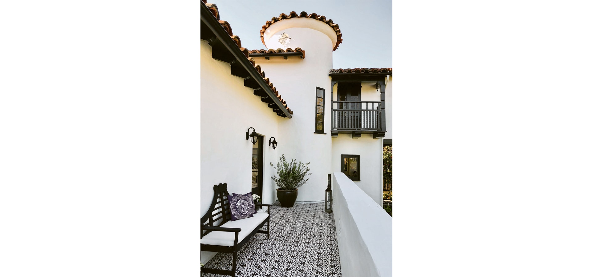
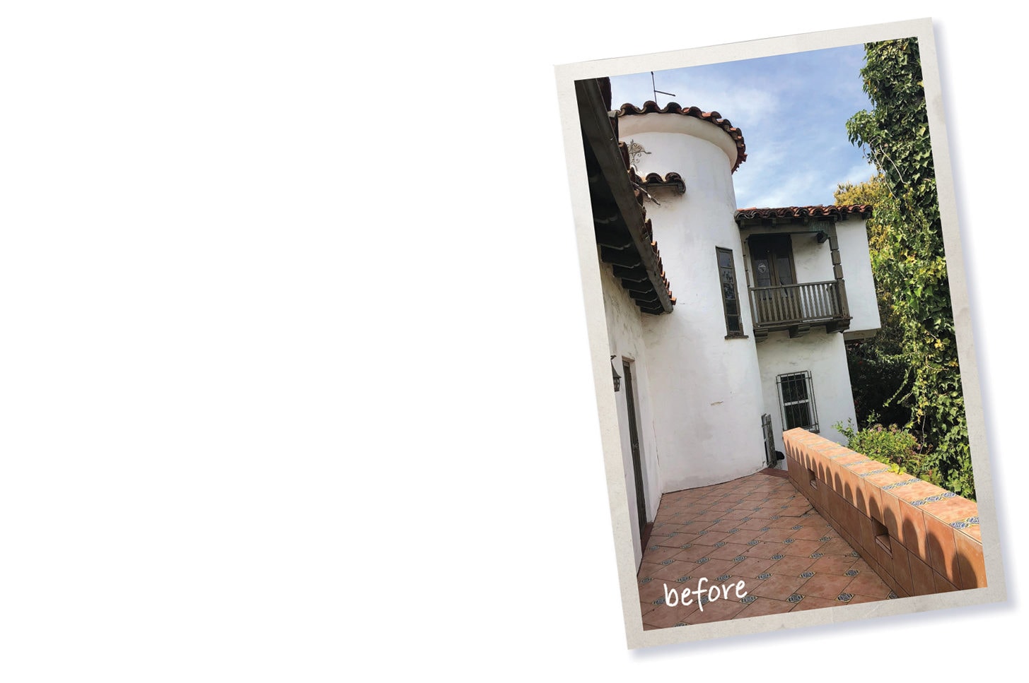
In renovating this 1930s Spanish home for a project I did called the Cococozy Design House, I knew the balcony was going to be one of the most integral elements. It overlooks a sprawling backyard and you can see it from every angle. The balcony felt dated and lifeless, so the decision to completely redo the tile was an easy one. The mission: to make the balcony pop. I wanted all eyes drawn to the new tile.
That said, the major challenge was choosing the tile color and pattern. I wasn’t entirely sure how I wanted to approach it. Since the space was a focal point on the property, I wanted the area to feel special and unique but also be comfortable. I envisioned this as a space that would be used and enjoyed—not one just for show. Part of me felt like big, bold, bright colors would make for an interesting design aesthetic. But I ultimately felt the black and white was more striking. Plus it makes the space feel modern yet timeless.
GET THE LOOK
- Wall paint White Dove and trim paint Blacktop by Benjamin Moore
- Pottery from Jackalope Pottery in North Hollywood jackalopepottery.com
- Tiles from Cement Tile Shop in West Hollywood
Family Room by Althena Calderone
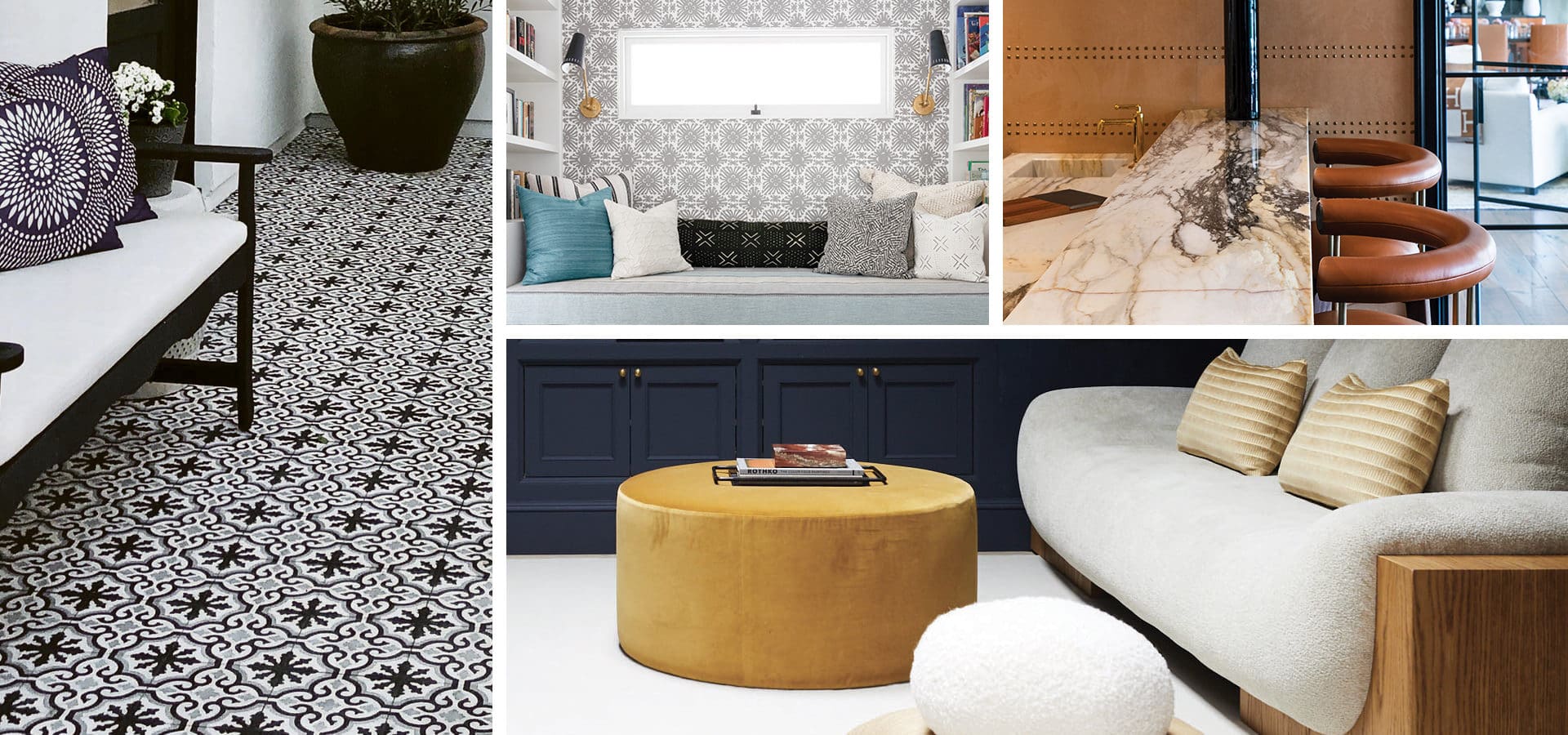
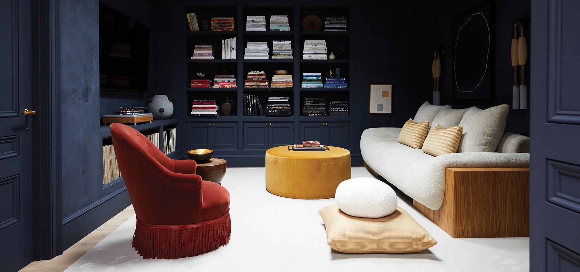
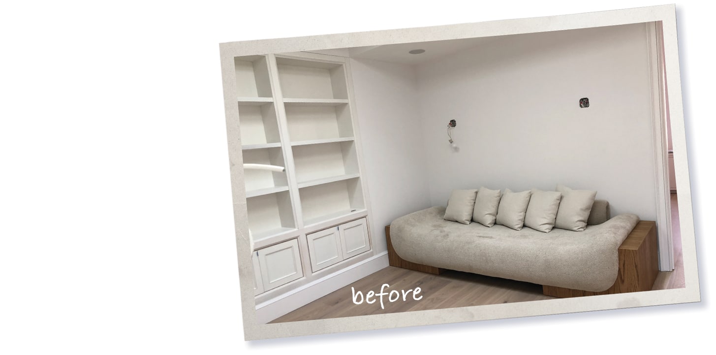
 For the family room at our home, I craved a formal library, but with the comfort to slouch into a plush sofa and watch movies or read. The initial vision was in line with the neutral tonality of the home, but something wasn’t working. The room felt incomplete.
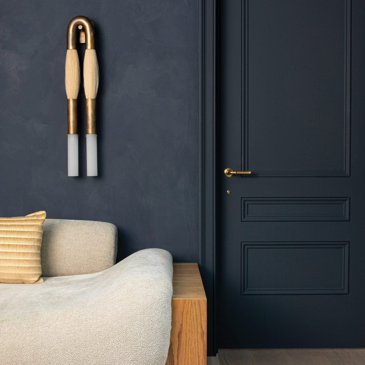
We zeroed in on wall color. The walls were white, and although it matched the rest of the house, it was boring. I decided to take a risk. We enveloped the walls and ceiling in deeply saturated plaster called In The Navy from Portola Paints, which has a suede-like quality. The paint completely transformed the room and gave it a cocoon-like feeling. Lesson: Acknowledge when it’s time to pivot and change direction from your initial design. It’s OK for a room to have its own identity, even if it’s a departure from the rest of your home.
The result? This room went from someplace we never use to one of our favorite spaces to gather as a family. It is that cozy nook I was craving.
Photographed by Nicole Franzen
GET THE LOOK
- Horsehair sconce apparatusstudio.com
- Rug | studiofournyc.com
- Athena Sofa giancarlovalle.com
- Mohair chair | chairish.com
- In The Navy by Portola Paints in North Hollywood portolapaints.com
Den/Bar by Orit Srour
@oritsrourdesigns on Instagram
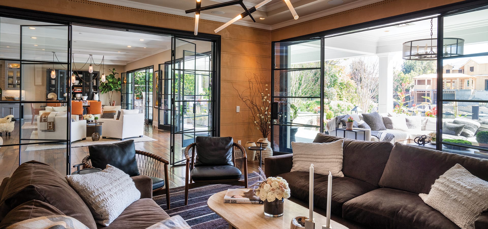
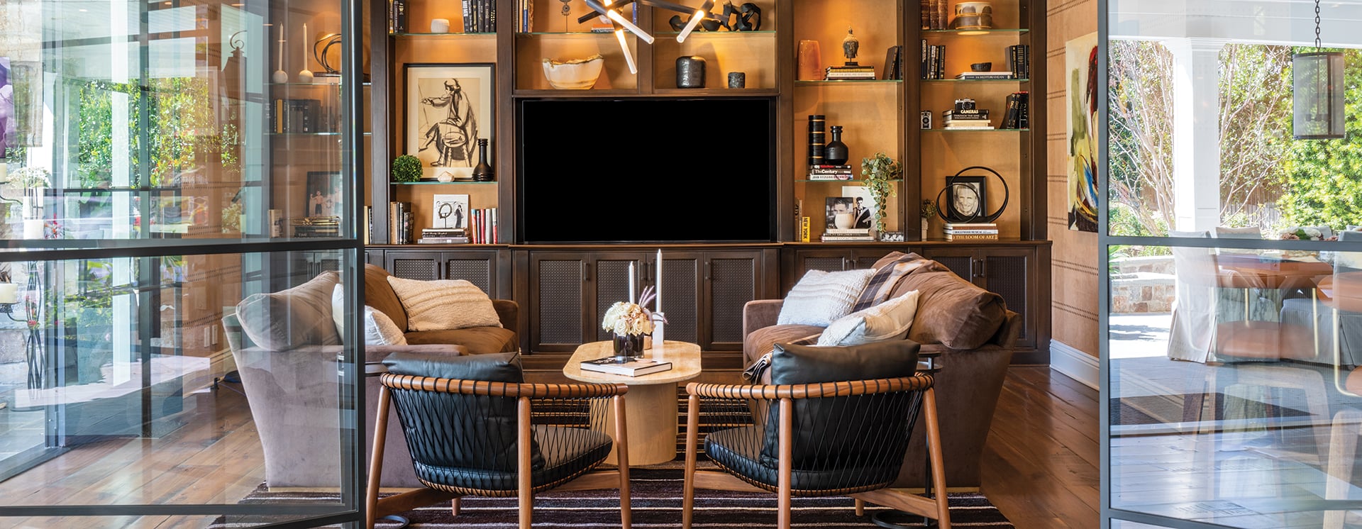
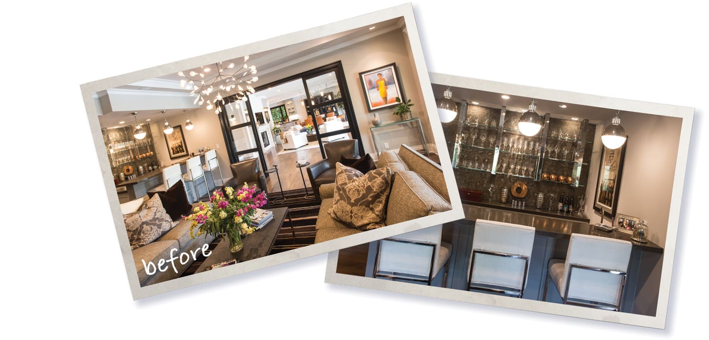
This den in a Toluca Lake traditional-style home was so cold, dowdy and unwelcoming that the clients rarely used the space. It lacked the chic and sophisticated style they were after. The couple wanted it to feel like the high-styled lounges of the New York hotels they frequent.
The bar got a total makeover. Because the cabinetry was well made and in excellent condition, I had my master carpenter add ¼-inch fluted oak panels to the existing faces. Then we applied a rich, dark, walnut stain. We selected super luxurious Italian marble that ultimately set the tones for the color scheme of the room—rich amber jewel tones. The velvet sofa and studded-brass suede-like wallpaper made the space feel cozy yet sophisticated.
The main attraction, though, is the steel doorway. We replaced the traditional wood doors for something more striking that would open up the space and allow for the view to shine through.
Photographed by Shane O’Donnell
GET THE LOOK
- Custom-made sofa by A. Rudin at the Pacific Design Center
- Bouclé pillows from Amber Interiors in Calabasas amberinteriors.com
- Travertine coffee table cb2.com
- Chandelier by Lindsay Adelman
- Calcutta Borghini marble
- Unlacquered brass faucet waterworks.com
Book Nook by Annie Fitzgerald and Maria von Hartz
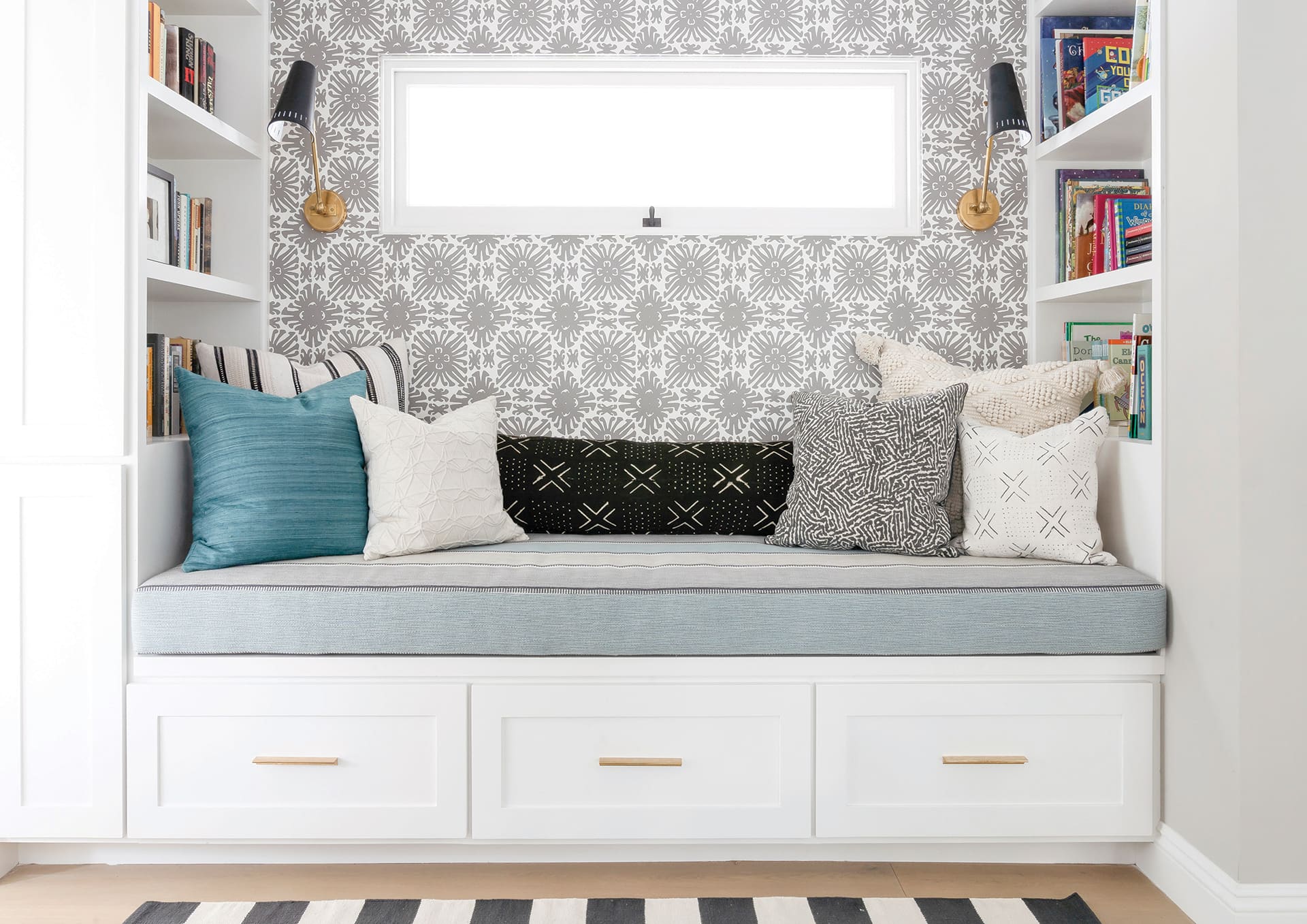
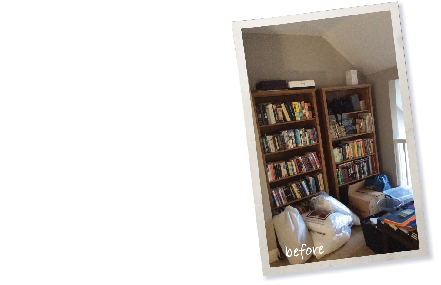
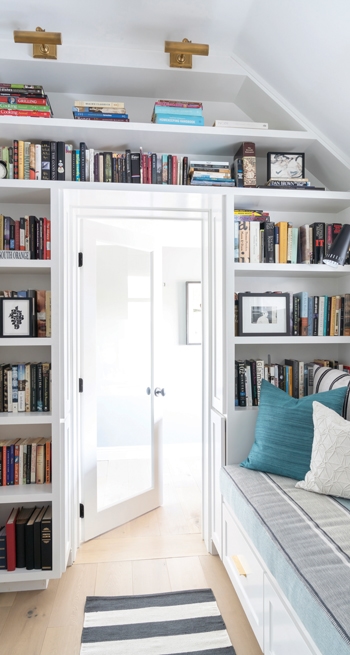 The room in this Studio City home was a weird dead space on the second floor with a balcony overlooking the kitchen. The open balcony gave the space a lot of light because it opened to the skylights in the kitchen, but created a safety hazard for the residents’ children. The challenge was to somehow keep the light but close it up and make it safe and cozy, and to squeeze every inch out of the square footage. Since they are a family that loves to read, we decided to create an inviting reading nook with a comfy daybed.
The balcony was demolished and we closed up the wall except for the custom interior window, which we had installed with safety locks to prevent it from opening too wide. We designed built-in bookshelves and the daybed, which has drawers underneath for extra storage. High-traffic fabric was used for the daybed along with playful wallpaper, pillows and fun patterns to make the space comfortable and inviting. Reading sconces were installed on either side of the window as well as picture lights above side shelves around the door to highlight the books.
Photographed by Annie Meisel Photography
GET THE LOOK
- Wall paint Simply White by Benjamin Moore
- Antonio Adjustable One Arm Wall Lamp | circalighting.com
- Library lights circalighting.com
- Pillows | crateandbarrel.com
- Solid brass tab pulls myknobs.com
- Daybed fabric Soraya in Rockpool by romo.com
- Wallpaper Sigourney Small Scale by China Seas quadrillefabrics.com
Join the Valley Community


