Most homes by renowned architect Richard Neutra have a moment in the spotlight—whether being mentioned in an article or featured in a coffee table book. But perched high on a hill in Sherman Oaks, down a private driveway, a modest Neutra home stood for more than a half century with hardly anyone taking notice.
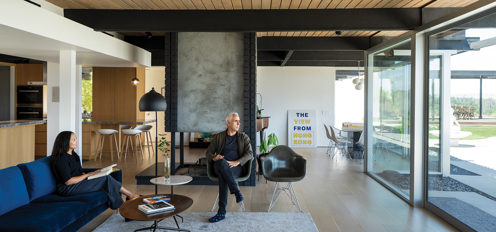
Above: Husband-and-wife architects Dora Chi and Eric Amir retained such Neutra hallmarks as abundant glass, wooden beams and open interiors.
•••
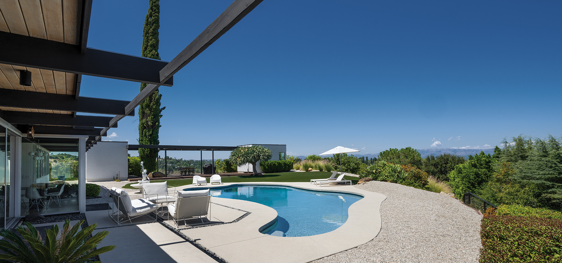
It was the home of TV writer Stephen Lord (Fantasy Island, CHiPS). In 1962 he commissioned Neutra to design the structure on a bluff overlooking the Valley. With a built-in bar and a corner office facing the view, the 2,600-square-foot house was originally designed as a bachelor pad. The structure featured Neutra’s design hallmarks: a geometry of glass, wooden beams, open interiors and seamless connection between the interior and outdoors. When Lord married and had three daughters, the structure was modified slightly, but for the most part, the architect’s original International Style design stayed intact for almost 60 years.
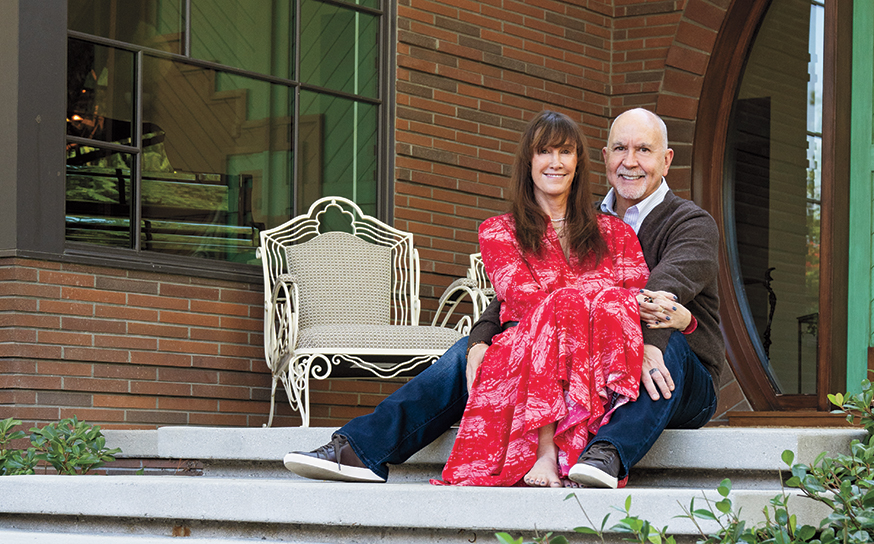
Enter Erik Amir and Dora Chi. The couple moved to the Valley, along with their two young sons, from Hong Kong in 2021. The husband-and-wife architects, who run their own firm called Spatial Practice, had bought a hillside lot and were designing their dream home in Studio City while renting in Sherman Oaks. They weren’t loving the accommodations.
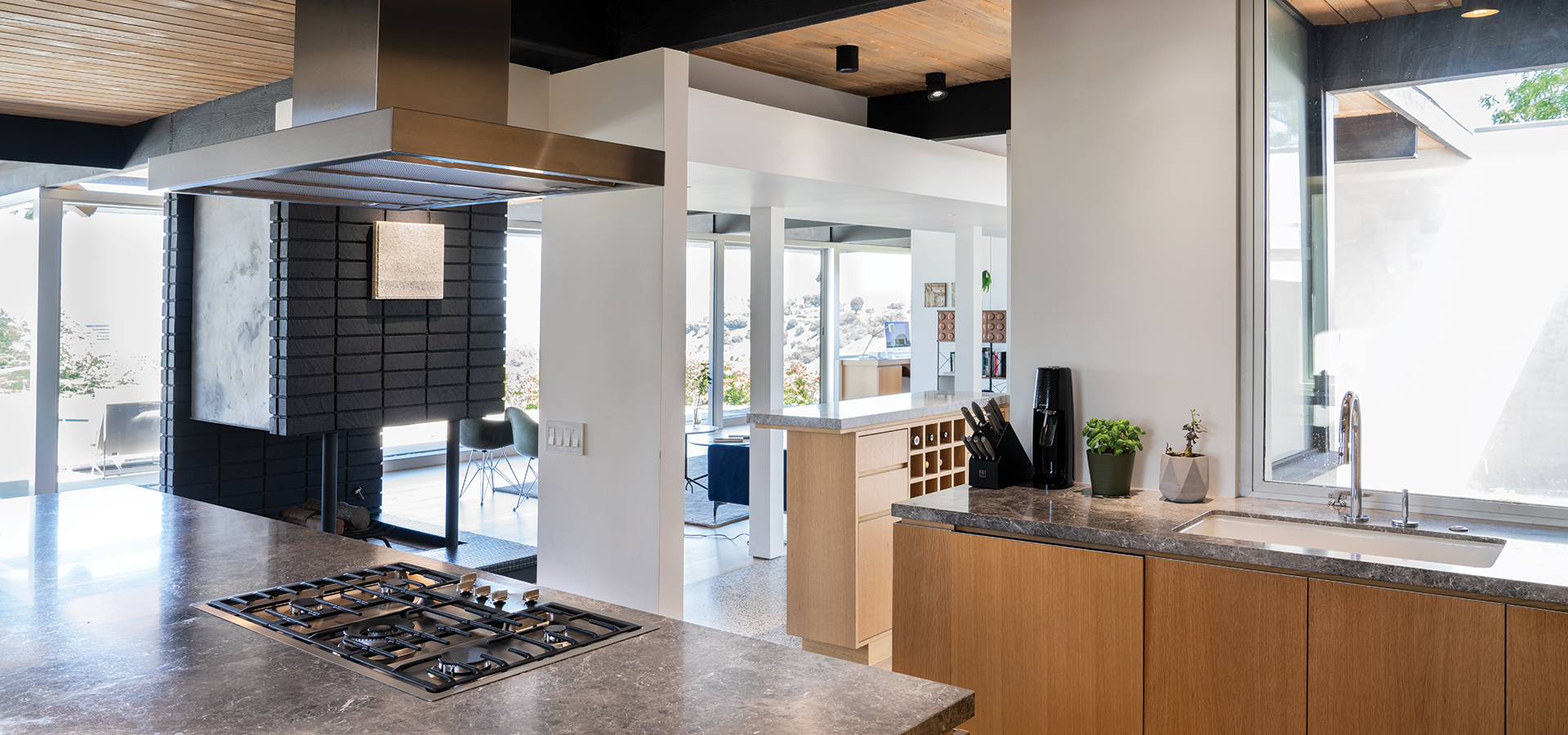
Above: When viewed from the kitchen, the connection between interior and exterior is evident.
•••
“We kept looking at rentals and the terms were just ridiculous. I thought, why don’t we just buy a small place we can quickly fix up and live there until our home is complete?” Erik says.
Their real estate agent suggested they see a Neutra that had come on the market. The agent warned them it wasn’t a quick fix-up; the house was in poor condition. A Neutra? The couple was intrigued and set up a walk-through, ultimately discovering the structure was in worse shape than they imagined. Lord died in 2012 and his widow in 2020. The one-level structure suffered water damage during a 2019 rainstorm and had sat exposed to the elements for several years.
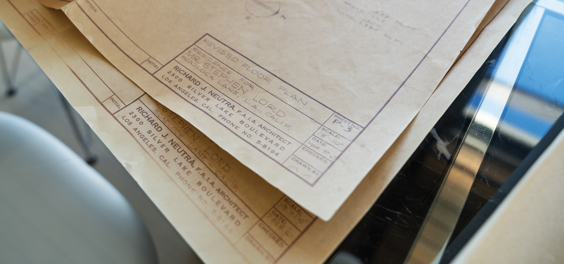
Above: Original Neutra house plans gave Dora “the chills.”
•••
“There was no electrical or water. It was uninhabitable,” Erik recalls. Yet the bones were there. So were the original plans. Gazing at the faded drawings today, spread on a table, Amir says, “Looking at these, just like when I first saw them—it gives me chills.”
The couple couldn’t resist. They bought the property and embarked on what would ultimately be a 16-month renovation, carefully preserving key design elements like the terrazzo floor at the entry.
“Most of what you see today with terrazzo is tiles. This floor is stones set in concrete, which you’ll see in a lot of Neutra homes,” says Dora, who is also a professor of architecture at USC.
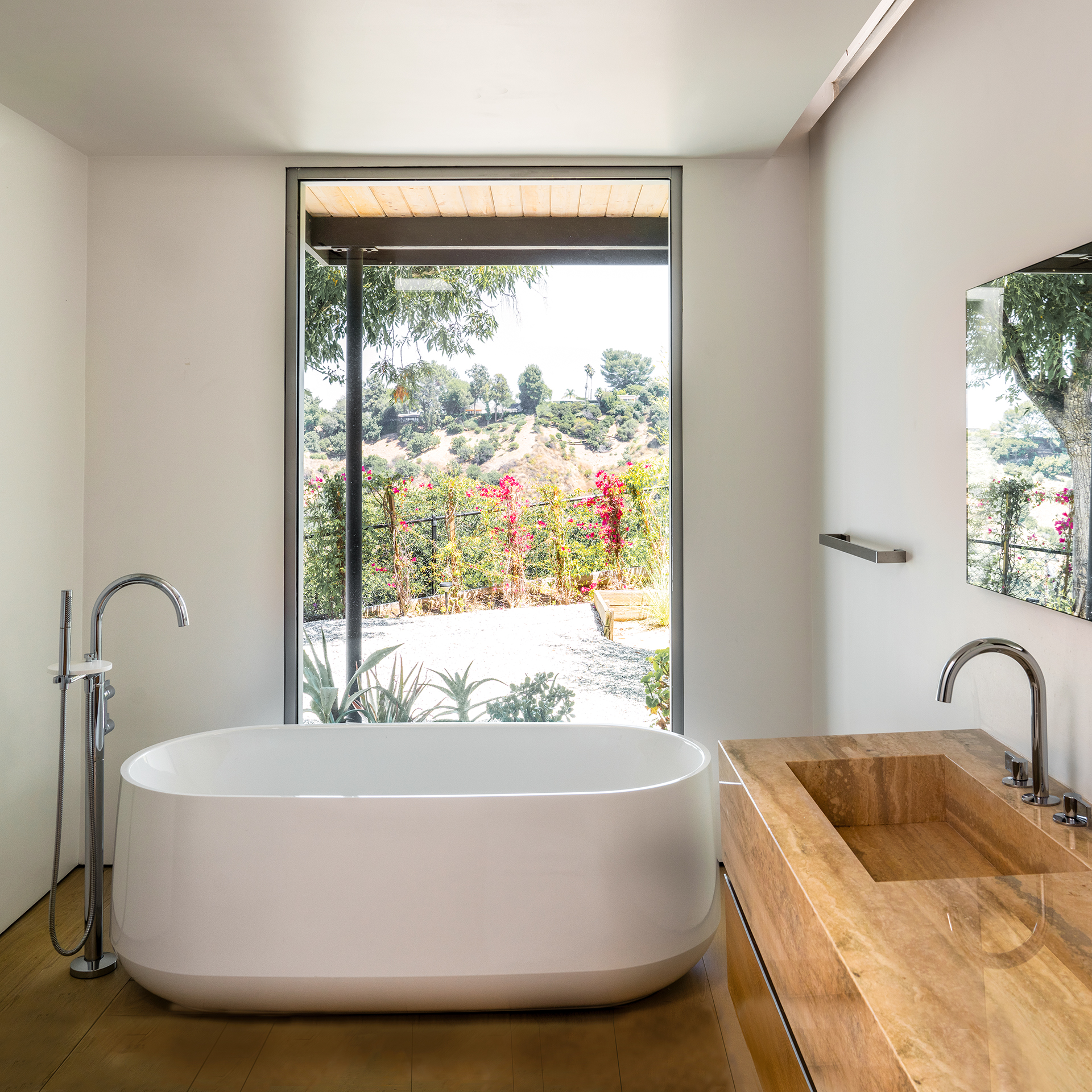
“We cleaned out any noise we saw. When we added, it had to be clean and simple,” adds Erik.
Updated features like white oak floors and kitchen cabinets and contemporary double-paned Fleetwood windows were installed. The bathrooms were all redone with travertine tile. Water pipes were relocated from the ground to the roof. The decidedly feminine, bean-shaped pool was given a facelift and a guesthouse with a contemporary pavilion was added. The Lords’ baroque-style sculptures stayed put.
Dora says that when it came to the interiors, they wanted to avoid all the “must-have” clichés. “To me, that is personal. We live in spaces. I thought, ‘What is the experience we as a family want to have here?’ It’s not about having a picture-perfect life like so often is presented on Instagram.”
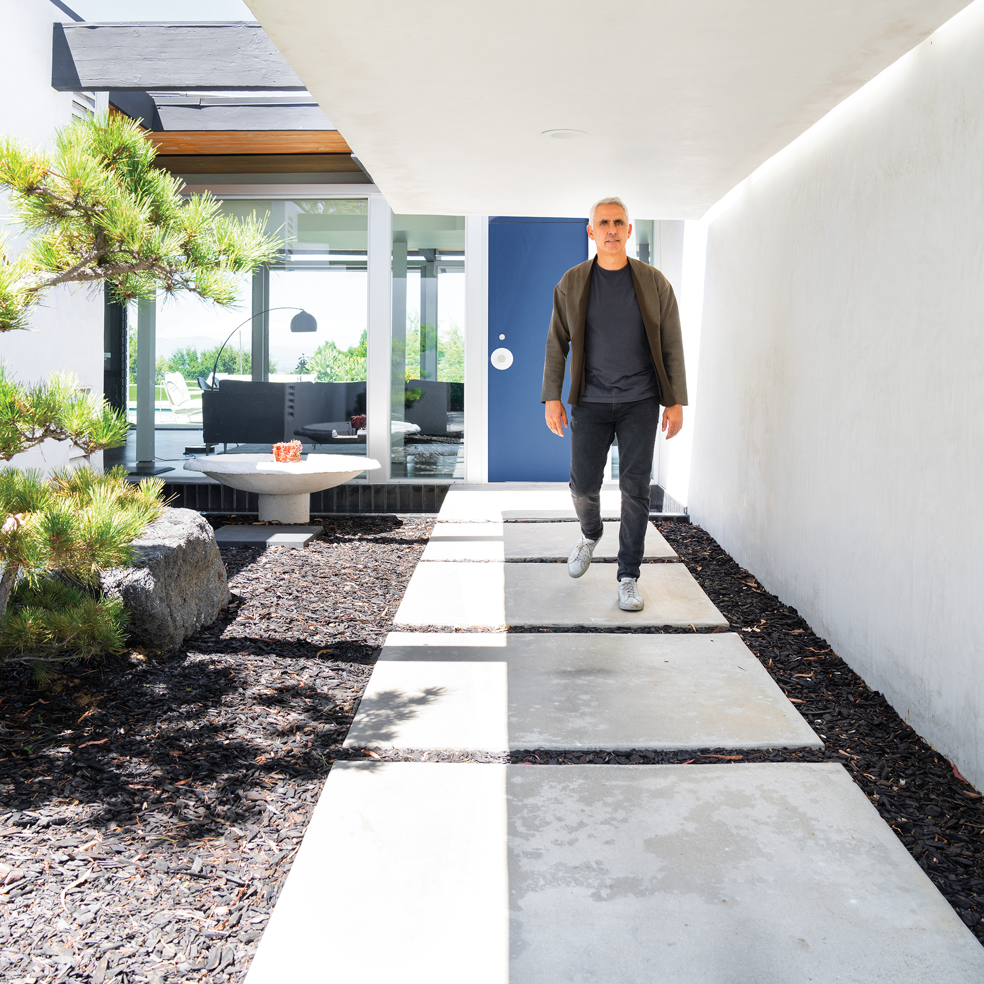
“It is very cinematic. Soft and warm. There is proportion and scale—and finesse.”
Blue, one of the couple’s favorite colors, is present in pops throughout the house. But for the most part, hues are a mix of natural taupes and grays. Strolling through the austere interiors, one gets the feeling that they didn’t want to detract from the brilliance of the design.
“It is very cinematic,” says Erik. “Soft and warm. There is proportion and scale—and finesse. When you walk in the front door you can see the light from the reflection pool outside dancing on the ceiling. You don’t need a lot of stuff around when you have that.”
Join the Valley Community


