The Design Trends of 2023 That Are Catching Our Eye
From headboards to plants.
-
CategoryHomes
-
Interview byLinda Grasso
-
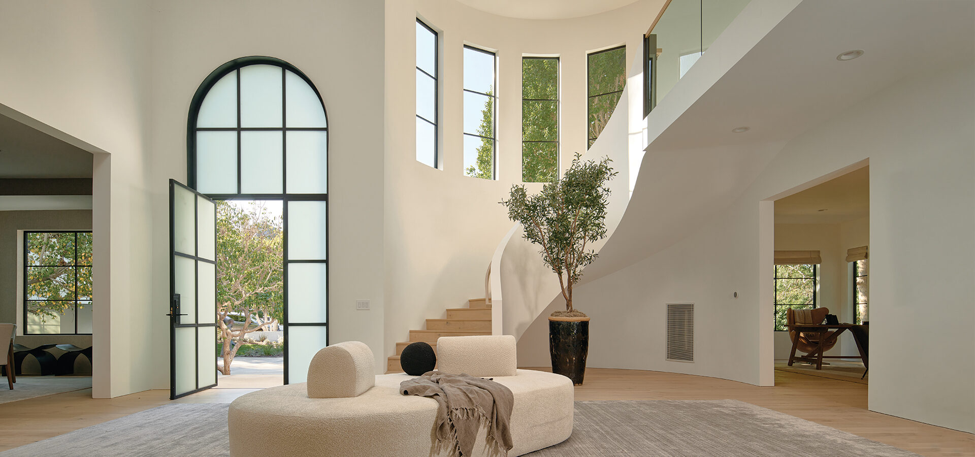
AbovePhoto courtesy of Meridith Baer Home. Photographed by Nils Timm.
Curvy sofas in the living room. An oversized photograph book on a stand. Faux sheep in the entry. Trends come and go. So why even pay attention them? Brian Ferrick, design director at the interior design mecca Meridith Baer Home, says if you avoid cliches and extremes, incorporating trends can add freshness and a new take on a traditional look. Here Brian shares five trends that fit that bill.
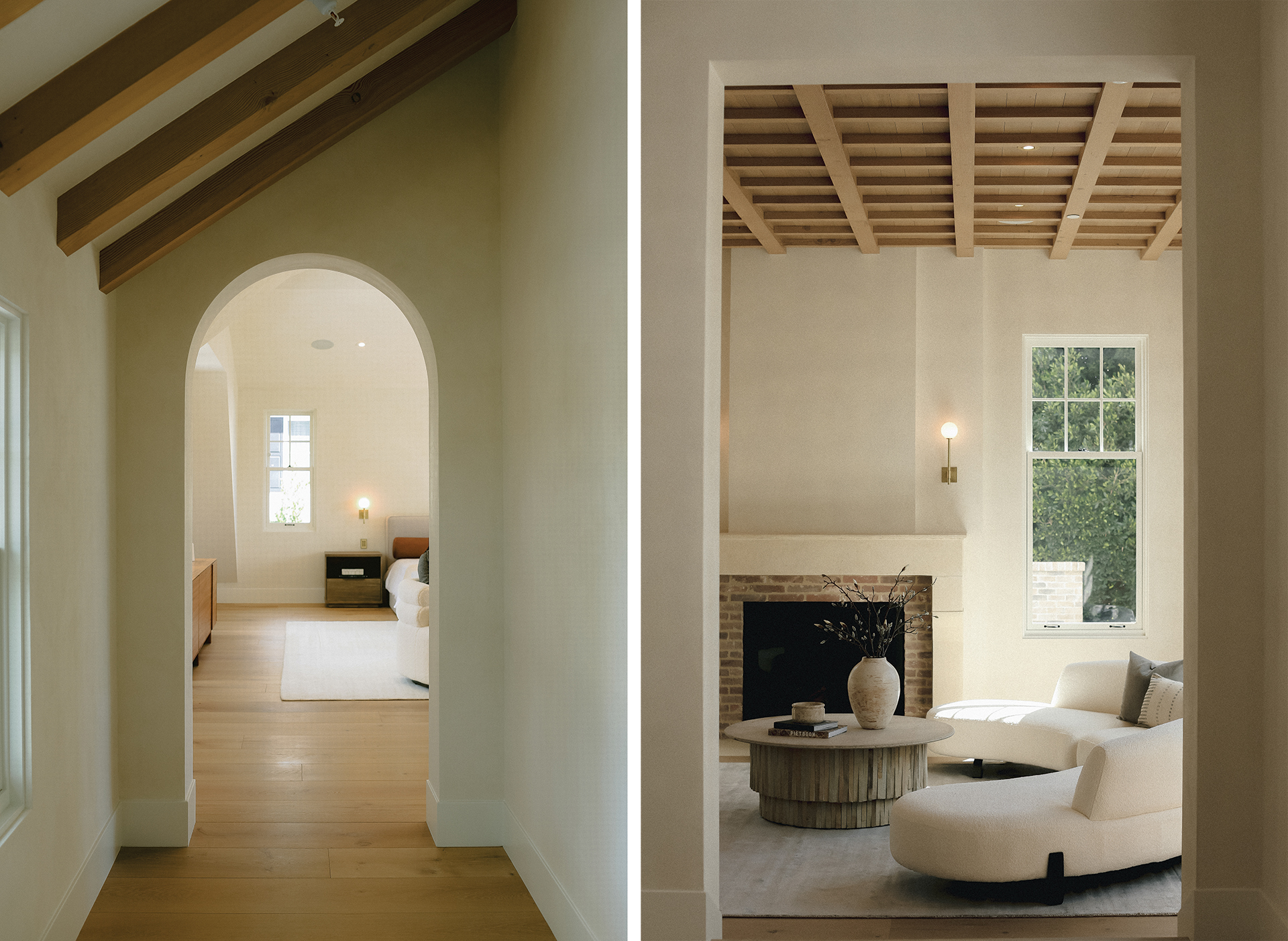
Photos courtesy of Meridith Baer Home. Photographed by Tam Lontok.
CURVED HEADBOARDS
Curved headboards are a departure from what we did traditionally here at Meridith Baer. We always offered very tall rectangular headboards. They were typically upholstered—either channel-quilted or tufted. But now we are seeing a lot of curved headboards that are little bit shorter, probably about 5 feet. It is a nice change and I like the softness. With the current move toward the California organic modern vibe, the soft shapes and rounded corners work well.
Pro tip: A curved headboard works well in both traditional and contemporary homes. I think for a kids room, two twin beds with curved headboards work beautifully. You could do a cute ticking on them, keeping it playful. For a contemporary primary bedroom, I like the channel quilting that runs horizontally instead of vertically. It has a more of a masculine feel to it.
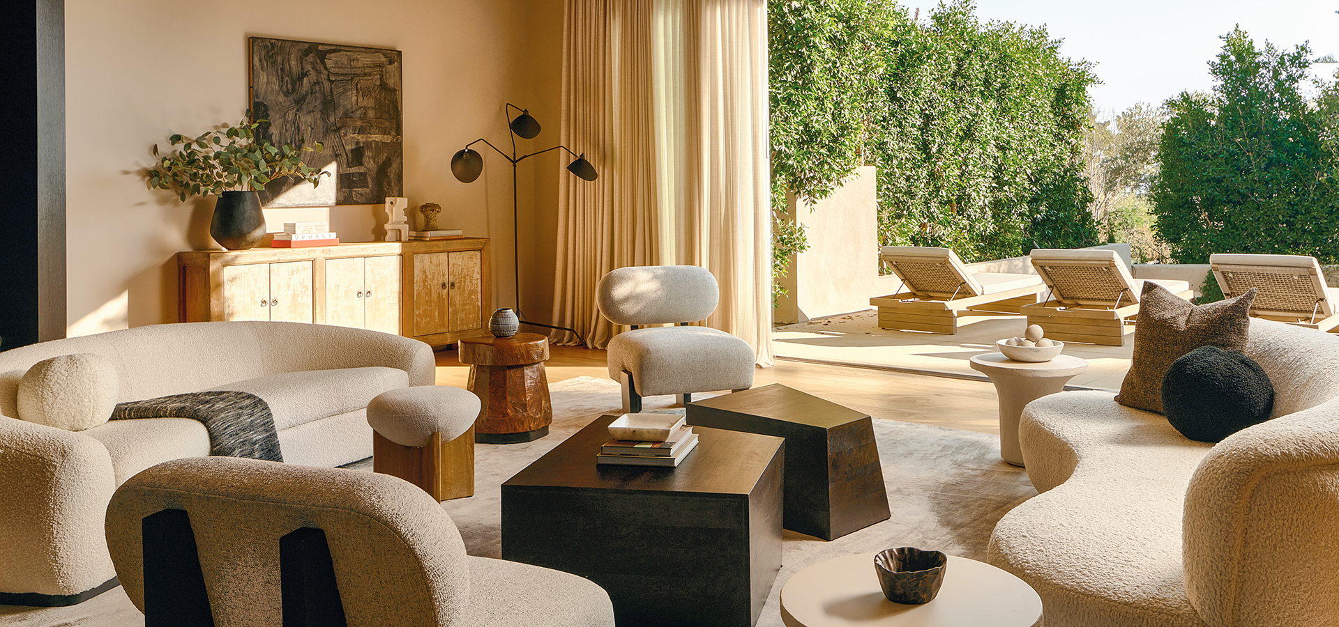
Above photo courtesy of Meridith Baer Home. Photographed by Nils Timm.
•••
PLASTER
Plaster has been around for years. With those faux-finish walls that were popular in the ’80s, they were doing plaster, but it tended to be pigmented with an ocher or greenish hue. The more recent applications have been with more of a neutral finish—paler whites and soft palettes. A tonal version of it. There’s texture to it, giving the play of light and a sheen, which can be quite beautiful. Plaster is a very traditional application, but we’re seeing it in homes that are contemporary in style. So again, it’s not the hard walls you typically see in contemporary homes, but a softer tone.
Pro tip: I love plaster walls in dining rooms with candlelight or a terrific chandelier with a soft white bulb. All these elements can help create the vibe of a romantic dinner.
ARTIFICIAL OLIVE TREE
When I first started with Meridith more than a decade ago, we always brought real trees into houses. The fiddle-leaf fig was a popular choice, but it was problematic. Often they weren’t properly maintained or getting the proper light, and they’d start to die. So we switched everything over to fake trees. The olive tree is popular right now. I like the delicate shape of the leaf, and for grand homes, you can get tall ones with a wider span, a canopy that spreads out. The look is just a little bit fresher, and a nice way to change it up.
Pro tip: Buy size based on the space. When there is height in a room, you want the tree to be full and tall, not to appear anemic. It needs to have some volume to it. Give the tree some room to breathe visually; you don’t want to have it cramped up and, say, leaning over a sofa. The goal is to create a sense of airiness.
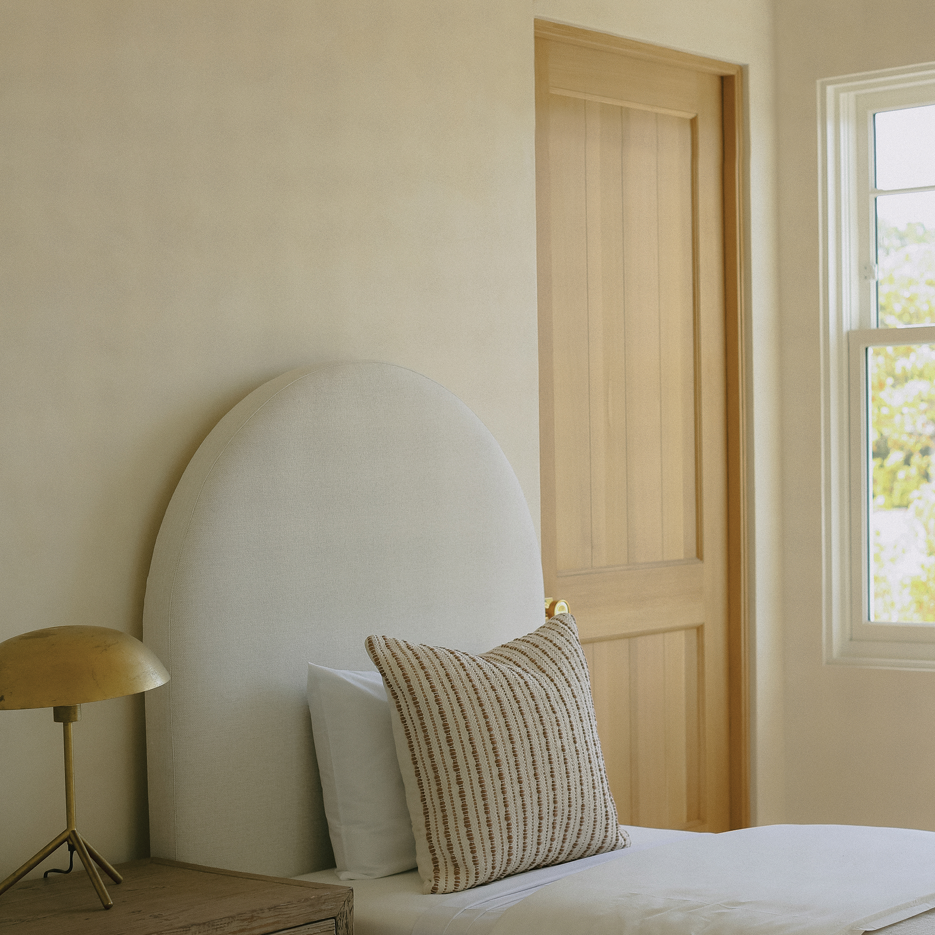
Photo courtesy of Meridith Baer Home. Photographed by Tam Lontok.
ARCHES
We’re seeing arches pop up more in contemporary environments. Not the hard-core contemporary that we’ve been used to the last 12 years or so. It is more of an organic modern vibe. For example, we’re seeing a lot of arches in beautiful plaster curved staircases. It is a departure from the trend in the last 10 years of the hard-core cantilevered steps with metal framing. Arches create a sense of calm, and that works well in, say, the private quarters going into the bedrooms. There’s a softness to it. It makes you feel like you’re in the Greek islands. It has that real transportive quality to it, which I think is quite beautiful.
Pro tip: You don’t want just one archway. The motif needs to repeat throughout the house, whether indoors or outdoors, like on a loggia or portico. Doorways in particular need to be consistent.
CALIFORNIA ORGANIC MODERN
This style or visual aesthetic is one that infuses a mixture of shapes and textures, natural woods, soft textiles and perhaps a little bit of iron. It’s also the mixture of new and curated objects, having things that are both old and new and blend together well. And integrate a collection. In Meridith’s living room, for example, she has antique Venetian glass, finials from iron rail posts, and little pre-Columbian clay dolls. Collections tell a story about who you are. The idea is to create a feeling of bringing the outdoors inside—bringing in wood, soft materials, nature, and mixing it all together.
Pro tip: Use softer upholstery with a more neutral tone. Then layer in great antique pieces, collected items, vintage textiles and maybe a great antique rug. The fluffy white or ivory bouclé thing is overplayed right now, but in general I still love bouclé. It is a great fabric, and comes in a million colors. I also love linen velvets, or a nice camel leather mixed in with a beautiful cream textured wool and linen fabric. Don’t be afraid to incorporate a pop of color with pillows or a fun chair. A nice splash always works.
Join the Valley Community


