A Calabasas Tuscan Undergoes a Dramatic Transformation, Emerging with a Bright, Timeless Vibe.
Neutrals rule.
-
CategoryHomes
-
Written bySusan S. Spillman
-
Photographed byShane O’Donnell
Darlene Finn shakes her head as she scrolls through old home photos on a laptop in her airy, white kitchen. There’s one of the living room, its walls awash in a yellow-gold faux finish with silk burgundy drapes that “puddle” on the floor. Another is of the old kitchen, which is olive and tan with travertine counters and distressed wood cabinets.
“I was in Tuscan hell,” laughs Darlene.
So was roughly half of the Valley a decade ago when Darlene and her husband, Heath, bought their home. Deep shades of red, gold and green, heavy wrought iron fixtures and chunky-framed oil paintings were all the rage at the time Darlene and Heath, a bank executive, moved to their two-story house in Calabasas Estates.
“The undertone is key in a house that’s going to be full of neutral tones. It makes everything feel fresh and light.”
“I have many clients who fell hard for the earthy brown Tuscan style and now feel trapped,” says Jennifer Grey of Jennifer Grey Interiors, who was hired for a major update of the 3,226-square-foot structure.
Jennifer’s advice to the couple, who have a 6-year-old son, was simple: Strip the house down and get rid of everything.
“That’s when you can finally see the bones of the house and bring out its best features,” the designer explains.
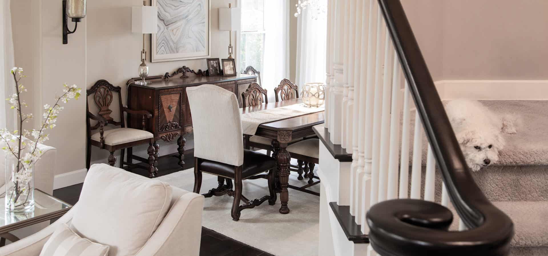
Eager for a dramatic transformation, Darlene did exactly that—keeping a handful of antique pieces, including a dining set from the 1920s that Heath inherited from a relative.
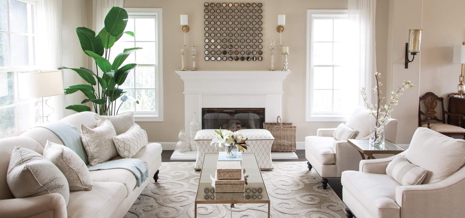
Darlene was set on a neutral paint palette. “That way I wouldn’t feel like in 10 years I would have to redecorate again,” she says. Jennifer agreed, adding, “Pairing antiques with neutrals makes them feel fresh.” For the downstairs living area, the women chose Benjamin Moore’s Manchester Tan, a light beige hue with a slight green undertone.
“The undertone is key in a house that’s going to be full of neutral tones,” says Jennifer. “It makes everything feel fresh and light.”
According to the designer, good lighting is crucial too. Not only was more and higher wattage added, careful consideration was given to selecting the mostly contemporary fixtures.
In the foyer visitors are greeted by a stunning sculptural chandelier of crystal with an aged brass finish, by Hudson Valley. “It reminds me of dandelions,” quips Darlene.
Another showstopper is the rectangular, taupe shade fixture with champagne gold detail and glass baubles, made by Finishing Touches. Both were purchased at One Stop Lighting in Thousand Oaks.
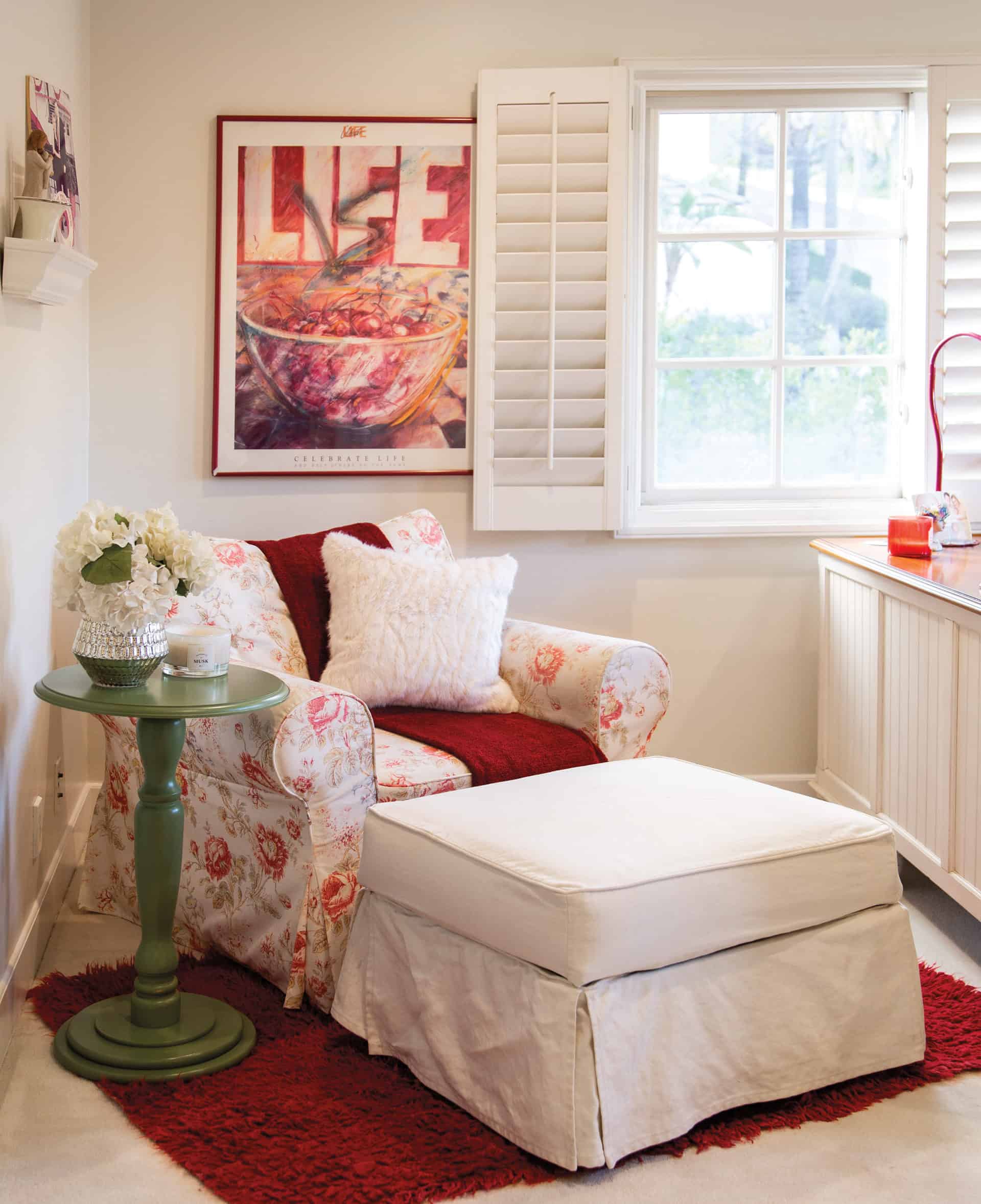
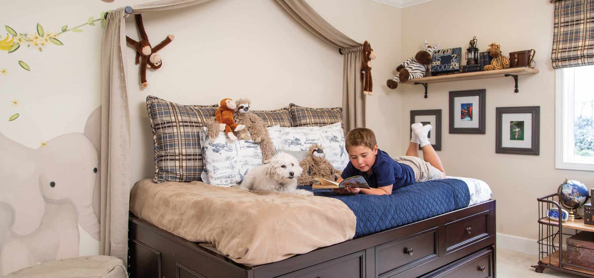
Despite a household that includes a child and two dogs, Darlene was adamant about sticking with whites and creams, so she could seasonally rotate colored garlands around the fireplace mantle, flowers and throw pillows. Originally Darlene instructed Jennifer not to use any blue in the house, but once son Clayton’s room was done in that color, she changed her mind. Jennifer says, “I added some pops of blue here and there, and Darlene ended up liking a few accent colors.”
For the living room seating, there’s a traditional tight-rolled arm on the sofa and slope armchairs in light upholstery that repeat the wall color. The ottomans were actually Darlene’s from the old Tuscan days, reupholstered in an arabesque fabric with light blue embroidery accents.
A mirrored coffee table helps further elevate the space with more light, as do the light linen drapes.
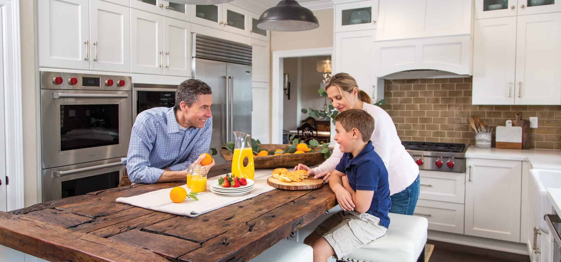
The kitchen layout remained the same. The tan faux-finish cabinets were swapped for a streamlined, white Shaker style. The travertine countertops were exchanged for quartz, except for one space. The area’s focal point, a century-old wood church door from Mexico that tops the center island, stayed put.
Sitting at the island flipping through the “before” photos, Darlene admits the makeover was exhausting and something she doesn’t care to repeat.
But with the neutral palette, which has a positive effect on her mood and energy, Darlene says, “The fact is I won’t have to.”
Join the Valley Community


