Designed for Two
An empty nest gets transformed into a sophisticated space for an adventure-loving Sherman Oaks couple.
-
CategoryHomes
-
Written bySusan Spillman
-
Photographed byShane O’Donnell
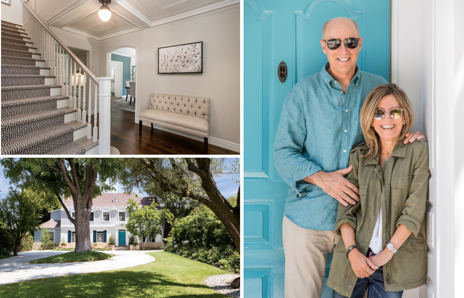
For years Eileen and Bob Stringer talked about selling their nearly 4,000-square-foot home in Sherman Oaks. They envisioned moving to the beach once their youngest son went off to college.
So last fall, with Dylan, 24, already graduated and pursuing a career as a screenwriter and Nicky, 21, off at Tulane University, the couple started house hunting in Manhattan Beach.
It didn’t take long though for Bob, a financial advisor, and Eileen, a talent manager, to do an about face. They realized that relocating would come at a steep price. The biggest negatives were the loss of privacy afforded by their current half-acre lot and proximity to urban neighborhoods. “Bob and I love to explore the diverse culinary landscape that is LA and we are a 15 to 20 minute drive from just about anywhere we’d like to go. Whether it’s brunch downtown, our favorite butcher in Los Feliz or over the canyon to West Hollywood or Brentwood, we feel like we live in the best possible place for our lifestyle,” Eileen shares.
So the Stringers opted to stay—with a caveat. “We decided to make this house a place we’d want to live for the next 25 years,” explains Bob.
Built in 1939 and luxuriously set back on a flat lot with stately, mature, multi-trunk trees, the two-story English traditional had plenty of room and lots of authentic character. One of the home’s previous owners (possibly the original owner) was a movie studio executive with Universal. When Bob and Eileen bought the house, like the family they bought it from, they opted to keep the mirror the film executive hung over the bar, with signatures from movie stars, including actress Deanna Durbin.
However the magnificent entry hall ceiling molding, step-down living room and beautiful half-circle, wood-paneled bar were overshadowed by a hodgepodge of textures and a drab, outdated color palate.
“The challenge was to keep the original elements that make the home beautiful but get rid of those that just looked old,” explains designer Patti Mazzarini of Pique Design.

The kitchen and upstairs had already undergone facelifts, but the remainder of the downstairs was in need of an extensive floor-to-ceiling makeover.
“The Stringers are well traveled and have a sophisticated sensibility of design,” explains Patti. “I wanted the house to reflect both of their styles and tastes.”
In only four months, the downstairs was transformed into a harmonious and stunningly modern, elevated casual living space, rivaling any remodel unveiled on HGTV’s Love it or List It.
Patti started literally from the ground up. The flooring was a mishmash of knotty gold pine, with slats that ran horizontally and vertically in adjoining rooms, while terracotta tile covered the floor in another. Heavy-hued needlepoint, floral area rugs in the living and dining rooms and a burgundy print runner paving the central staircase contributed to the chaos.
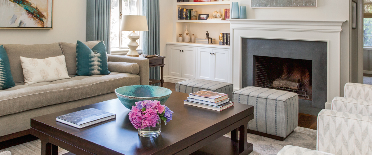
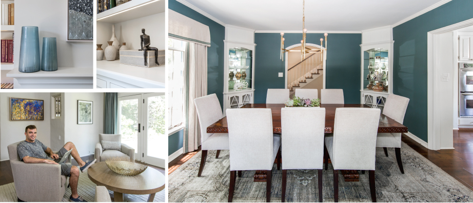
The first unifying step was installing a rich, walnut wood floor throughout. The next selection was a grey and off-white contemporary, soft, geometric print area rug for the living room. It was a unanimous choice that inspired the entire new color scheme, which includes pops of teal, taupe and dark chocolate.
The original heavy, brown wood doors that connected the entry hall to the living and dining rooms were removed. The entryway ceiling molding, four built-in dining room corner cabinets and original trim were all brightened with a shade of chalky, off-white Farrow & Ball paint. But the living room beadboard and red brick that encased the room’s fireplace didn’t make the cut. The brick was replaced with black slate. Built-in cabinetry was also added around the fireplace, so perfectly executed it looks original to the house. All cabinet and doors were outfitted with new, matte black hardware. Another seemingly small change that had a big impact was adding recessed lighting to the living room.
The second major design challenge was figuring out what to do with the “terracotta room,” nicknamed by the Stringers for its incongruous flooring. For a decade, the space, which is off the living room and faces the verdant backyard, was used simply as a spot for the boys’ baby grand piano.
Patti turned it into a “conversation room” with a low round table, four comfy, custom-made upholstered chairs and a textured, natural tone area rug. A painting by abstract artist Lee Mullican, who also has works on display at MOMA and the Met, provides a focal point.
The Mullican piece was one of several paintings Bob and Eileen added to their eclectic, distinguished art collection. Other noteworthy purchases are in the living room: a Seiko Tachibana abstract that hangs over the fireplace and an acrylic on canvas by Margaret Lazzari, with hints of teal and chocolate, that looks like it was commissioned for the home.
“We love that all the qualities that first attracted us to the home are still here, reimagined and refined,” says Eileen, adding, “We’ve never given the beach a second thought.”


